
Chat Kit
Full-featured iMessage/WhatsApp-inspired chat with 1-1 and group conversations, attachments, polls, GIFs, location sharing, reactions, and Socket.IO real-time transport.
Quick reference
CLI commands
# Add Chat UI components
npx @fivfold/ui add chat

# Add Chat backend (NestJS + TypeORM + Socket.IO)
npx @fivfold/api add chat --framework=nestjs --orm=typeorm

# Use MongoDB + Mongoose
npx @fivfold/api add chat --framework=nestjs --orm=mongoose

# Use Express + Prisma
npx @fivfold/api add chat --framework=express --orm=prisma

# Dry run to preview generated files
npx @fivfold/ui add chat --dry-run
npx @fivfold/api add chat --dry-run
Overview
The Chat Kit is a production-ready messaging system scaffolded across your full stack. It follows Hexagonal Architecture so you can swap databases, ORMs, and real-time providers without touching your domain logic. Supported combinations:
| Layer | Options |
|---|---|
| Framework | NestJS, Express |
| SQL | TypeORM (PostgreSQL, MySQL, MariaDB, MSSQL), Prisma |
| NoSQL | Mongoose (MongoDB), Prisma (MongoDB connector) |
| Cloud NoSQL | Azure Cosmos DB SDK, AWS DynamoDB SDK |
| Realtime | Socket.IO (WebSocket — auto-selected) |
1-1 & Group Chats
Private DMs and multi-participant group conversations with admin roles, member management, and leave/remove actions.
Rich Messages
Text, images, videos, files, audio, GIFs (Tenor API), location pins, and interactive polls — all sent as typed message variants.
Real-time Updates
Socket.IO WebSocket rooms with typing indicators, presence detection, read receipts, and message delivery events — works with any database.
Reactions & Read Receipts
Per-message emoji reactions, per-message read-by tracking, and animated typing indicators with user avatars.
Search
Full-text search across conversations and message content with paginated results grouped by type.
Glassmorphism UI
Backdrop-blur message bubbles, smooth framer-motion animations, and fully responsive layout from mobile to desktop.
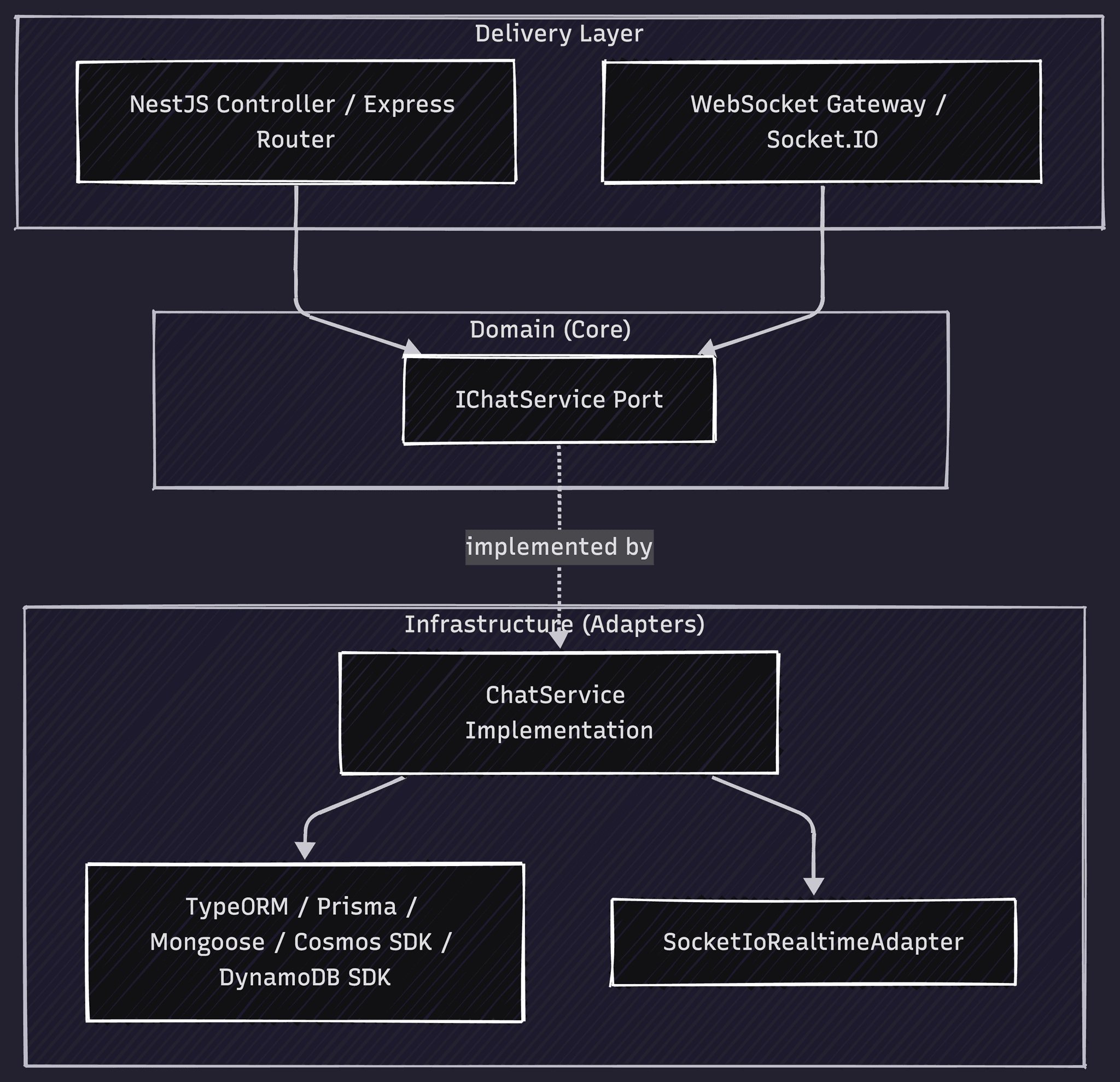
Architecture
The Chat Kit backend strictly follows Hexagonal (Ports & Adapters) Architecture. The domain port (IChatService) is framework and database agnostic — the delivery and infrastructure layers are generated separately based on your stack selection.
Demo
Interactive preview with simulated real-time replies and mock data
Sarah Johnson
Online
Shared Media
Guide
Step-by-step guides for the frontend UI and backend API integration. In the sidebar, pick Frontend first (Next.js or Vite), then runtime through ORM; the API tab uses the same selection for CORS and connection steps.
The Chat Kit UI is built on shadcn/ui with Tailwind CSS v4. All components are fully customizable and support light/dark mode via CSS variables.
1Install the Chat Kit
Run the FivFold UI CLI after initializing your project with npx @fivfold/ui init.
npx @fivfold/ui add chatComponents are placed in @/components/ui/kits/chat/.
2Generated file structure
kits/chat/
  types.ts                   # All shared TypeScript types
  index.tsx                  # ChatKit root component + re-exports
  chat-avatar.tsx            # ChatAvatar, GroupAvatar
  threads-list.tsx           # Sidebar conversation list
  thread-item.tsx            # Individual thread row with context menu
  conversation.tsx           # Message view with infinite scroll
  message-bubble.tsx         # Message bubble (text, image, poll, location, GIF)
  message-input.tsx          # Compose bar with attachment/GIF/poll/location
  typing-indicator.tsx       # Animated typing dots
  attachment-picker.tsx      # File/image/video picker with drag-and-drop
  gif-picker.tsx             # Tenor GIF search and picker
  poll-creator.tsx           # Create poll dialog
  poll-display.tsx           # Rendered poll with vote progress
  location-picker.tsx        # Share location (geolocation or manual)
  location-display.tsx       # Static map + Google Maps link
  reaction-picker.tsx        # Quick emoji reaction overlay
  search-panel.tsx           # Full-text search dialog
  new-chat-dialog.tsx        # Start DM or create group dialog
  contact-detail.tsx         # Contact info sheet
group-detail.tsx # Group info, members, admin controls3Import and use in your app
import { ChatKit } from "@/components/ui/kits/chat";
import type {
  FivFoldChatConversation,
  FivFoldChatMessage,
  FivFoldChatUser,
} from "@/components/ui/kits/chat";

export default function ChatPage() {
  const currentUser: FivFoldChatUser = {
    id: "u1",
    name: "You",
    email: "you@example.com",
  };

  return (
    <ChatKit
      currentUser={currentUser}
      conversations={conversations}
      onSendMessage={handleSendMessage}
      onCreateConversation={handleCreate}
      onVotePoll={handleVote}
      onAddReaction={handleReaction}
      onMarkRead={handleMarkRead}
    />
  );
}4Props reference (ChatKit)
| Prop | Type | Purpose |
|---|---|---|
| currentUser | FivFoldChatUser | The logged-in user. Used to determine sent/received and show own avatar. |
| conversations | FivFoldChatConversation[] | All conversations to display in the sidebar thread list. |
| onSendMessage | (convId, dto) => void | Called when user sends any message type (text, attachment, poll, location, GIF). |
| onCreateConversation | (dto) => Promise<Conversation> | Called when user starts a new DM or group. Return the created conversation. |
| onVotePoll | (pollId, optionIds) => void | Called when user votes on a poll. PATCH /api/chat/polls/:id/vote. |
| onAddReaction | (msgId, emoji) => void | Called when user reacts to a message. POST /api/chat/messages/:id/reactions. |
| onMarkRead | (msgId) => void | Called when a message enters the viewport. PATCH /api/chat/messages/:id/read. |
| typingUsers | Record<string, string[]> | Map of convId → userIds currently typing. Drives the animated typing indicator. |
| onTyping | (convId, isTyping) => void | Emit typing start/stop events to your real-time backend. |
| loadingMessages | boolean | Show skeleton loaders while fetching message history. |
| hasMoreMessages | boolean | Enable the "load more" trigger at the top of the message list. |
| onLoadMore | () => void | Called when user scrolls to the top. Fetch the next page of messages. |
5Integration with backend
Connecting Chat (UI layer) data to your user system
The kit needs a currentUser object and conversation data from your API. User ids in props, REST calls, and Socket.IO handshakes must all refer to the same identifiers your backend stores on participants and messages.
- Set currentUser.id to the same value the API uses for req.user.id (or your dev-user header during local testing).
- When rendering participants and avatars, map userId fields from DTOs to display names via your user directory.
- Socket.IO query userId and REST headers must stay in sync so typing and read receipts target the right participant.
Inspect generated code
userId, ownerId, etc.) to your User table or IdP subject. Migrate or add FKs where needed—FivFold cannot know your prior schema.You own the wiring
The step-by-step guides, environment variables, and dev-server proxy or rewrite examples are suggestions—not a mandated layout. You should read the generated files, your existing routes and auth, and your deployment topology, then choose URLs, origins, and headers that match your app. We encourage verifying every connection yourself before shipping.
After you add Chat UI + Chat API — checklist
Scaffolding aligns routes and dependencies; your app still needs a thin integration layer. Work through these in order for local dev:
- Identity on the API: Nest registers
ChatModulebut does not auto-wireChatDevUserMiddlewareinmain.ts. Either register it (see below) or use real auth soreq.user.idexists — otherwise REST handlers throw at runtime. - Socket.IO through the dev server: Add a rewrite for
/socket.ioto your API (same idea as REST), or pointsocket.io-clientat the API origin. - Same user id everywhere: send
X-User-Idon fetch (or JWT) matchingcurrentUser.idin the kit and the server's dev default / env (DEV_USER_ID). - Integration host:
ChatKitis presentational — add a page or module that loads conversations/messages from your API, maps DTOs toFivFoldChat*types, and implementsonSendMessage, search, and socket listeners (see examples below). - Generic FE ↔ BE patterns (proxy, CORS) also apply — see Installation → Connecting UI and API.
Full-stack local dev (your app code)
FivFold adds the ChatKit components and installs dependencies. Everything below is outside the kit: dev-server routing to your API, env vars, fetch/socket helpers, and a thin host that maps API DTOs to FivFoldChat* types. Match the Frontend choice in the stack sidebar (Next.js).
Not for production as-is
Step-by-step: Chat UI → API
Examples match the Frontend choice in the stack sidebar (Next.js). Your mount paths may differ; adjust prefixes to match how you register routes and proxies.
Next.js → API
Prefer rewrites in next.config.ts so browser code can use same-origin paths like /api/chat/... while the dev server forwards to your backend. Alternatively set NEXT_PUBLIC_API_URL and call that base from client code.
// next.config.ts — example rewrite to API on another port
import type { NextConfig } from 'next';

const nextConfig: NextConfig = {
  async rewrites() {
    return [
      {
        source: '/api/:path*',
        destination: 'http://localhost:3001/:path*', // your Nest/Express port
      },
    ];
  },
};

export default nextConfig;
If the app and API both use port 3000, run the API on a different port (e.g. 3001) or use a monorepo BFF pattern.
API → browser (CORS)
Allow your UI's dev origin on the API. For Next.js that is typically http://localhost:3000 (plus 127.0.0.1 if you use it).
Production
https://api.example.com/chat) and lock CORS to known web origins — not *.Realtime: For Socket.IO with Next.js dev, rewrite `/socket.io` to your API host (same pattern as REST) or use a server that shares the HTTP server with Socket.IO.
Next.js rewrites (Chat + Socket.IO)
Browser code should call /api/chat/.... Use rewrites so the Next dev server forwards to your API. Add a second rule for /socket.io if the client connects through the app origin.
// next.config.ts — Chat REST + Socket.IO through dev server (example)
import type { NextConfig } from 'next';

const API = process.env.CHAT_DEV_API ?? 'http://localhost:3001';

const nextConfig: NextConfig = {
  async rewrites() {
    return [
      { source: '/api/:path*', destination: API + '/:path*' },
      { source: '/socket.io/:path*', destination: API + '/socket.io/:path*' },
    ];
  },
};

export default nextConfig;
Environment variables (frontend)
| Variable | Role |
|---|---|
| NEXT_PUBLIC_CHAT_DEV_USER_ID | Must match the API “current user” (same value as X-User-Id header and server default, e.g. dev-user-local). Name it however you like in your own apiUrl helper. |
| NEXT_PUBLIC_API_URL | Optional production API base. If empty, use same-origin /api/... (rewrites/proxy in dev). |
| NEXT_PUBLIC_SOCKET_ORIGIN | Optional; default window.location.origin so Socket.IO goes through the app dev server. |
API + Socket helpers (you implement)
Add small modules in your repo, e.g. src/lib/api.ts with fivFoldUserId(), fivFoldAuthHeaders() (X-User-Id), and apiUrl(path). Use socket.io-client with io(`${origin}/chat`, { path: '/socket.io', query: { userId } }) — namespace /chat and path /socket.io must match the Nest gateway.
Integration host (you implement)
One component (e.g. src/integration/fivfold-chat-host.tsx) should load conversations/messages from REST, map DTOs to kit types, pass callbacks that fetch the Chat API, and subscribe to message:new / typing events. If list endpoints omit participants, synthesize minimal participant rows for avatars or extend your API.
TypeScript strict / shadcn quirks
- Stray
@folder: If shadcn created@/components/...on disk, ensurecomponents.jsonaliases matchtsconfigpaths. FivFold'saddcommand attempts to merge misplaced files intosrc/components/ui. noUnusedLocals: Strict projects may need relaxed rules for generated kit folders, or enable incremental cleanup.- Dialog close button: Newer shadcn uses
showCloseButton; the kit templates use that API.
6Third-party integrations
The Chat Kit UI integrates with external services for GIFs, file uploads, and location sharing. Configure these in your frontend; the API supports the corresponding message types (see API tab).
Tenor GIF integration
Tenor (by Google) provides a GIF search API. The gif-picker.tsx component calls Tenor directly for search; when the user selects a GIF, it sends a message via onSendMessage with type: "gif" and metadata: { tenorId, url, previewUrl, ... }.
Flow: (1) User opens GIF picker → frontend calls Tenor Search API with query. (2) User selects GIF → call onSendMessage(convId, { type: "gif", metadata: { tenorId, url, previewUrl, description } }). (3) Your backend receives POST /api/chat/conversations/:id/messages and creates the message. (4) Optionally call Tenor's Register Share endpoint when a GIF is sent to improve future search results.
// gif-picker.tsx — Tenor Search (frontend)
const res = await fetch(
  `https://tenor.googleapis.com/v2/search?q=${query}&key=${TENOR_API_KEY}&client_key=my_app&limit=8&media_filter=tinygif,gif`
);
const data = await res.json();
// Use tinygif for previews, gif for the URL sent in metadata
Setup: Create an API key in Google Cloud Console and enable the Tenor API. Use NEXT_PUBLIC_TENOR_API_KEY for client-side search, or proxy Tenor through your backend. Include client_key in all requests. Tenor requires attribution — see their attribution guide.
File storage (attachments)
The attachment-picker.tsx lets users select files. Attachments are stored in object storage — not in your database. Your frontend must upload the file first, then call onSendMessage (or your attachment endpoint) with the resulting URL.
- User selects file → upload to S3, GCS, R2, or your backend proxy (presigned URLs, etc.).
- On upload complete → call your API with
url,name,size,mimeType. - Backend creates Message + Attachment; UI displays via
message-bubble.tsx.
Recommended: AWS S3, Google Cloud Storage, Cloudflare R2, or Azure Blob. Generate thumbnails for videos and pass thumbnailUrl for faster rendering.
Location sharing
The location-picker.tsx and location-display.tsx components handle sharing and display. Use navigator.geolocation.getCurrentPosition() to obtain coordinates, or allow manual input. Send via onSendMessage with type: "location" and metadata: { latitude, longitude, label? }.
No external API required. location-display.tsx can use OpenStreetMap for the preview and link to Google Maps for "Open in Maps".
7Shadcn primitives dependencies
npx @fivfold/ui add chat runs shadcn add for the list below. If anything is missing, run the same command manually from the project root where components.json lives so paths resolve (see troubleshooting in full-stack integration).
| Primitive | Used for |
|---|---|
| dialog | New chat, search, GIF, location, polls, attachments |
| tabs | Tabbed dialogs |
| separator | Layout dividers |
| scroll-area | Scrollable lists |
| input | Text fields |
| textarea | Composer |
| label | Form labels |
| badge | Thread metadata |
| tooltip | Toolbar hints — wrap the app in TooltipProvider |
| dropdown-menu | Thread row ⋯ menu, sidebar overflow, chat header ⋯ menu |
| context-menu | Thread / message actions (right-click) |
| alert-dialog | Destructive confirms (e.g. leave group) |
| switch | Poll options |
| progress | Poll UI |
| button | Everywhere |
8Additional dependencies
Besides shadcn/ui primitives, npx @fivfold/ui add chat adds these npm packages (declared in the kit manifest ui/manifests/chat.kit.json):
framer-motion— layout animations (typing indicator, message transitions).date-fns— message timestamps and relative time.emoji-mart— emoji picker for reactions and compose.socket.io-client— optional real-time layer when you wire the kit to a Socket.IO backend (see integration section).